Nederlands
Een boek moet eerst moeiteloos leesbaar zijn voordat het indruk probeert te maken. Lettertype, zetbreedte en regelafstand moeten de lezer zonder wrijving door de pagina laten bewegen.
Bewerkt naar William Morris, Het ideale boek (1893).
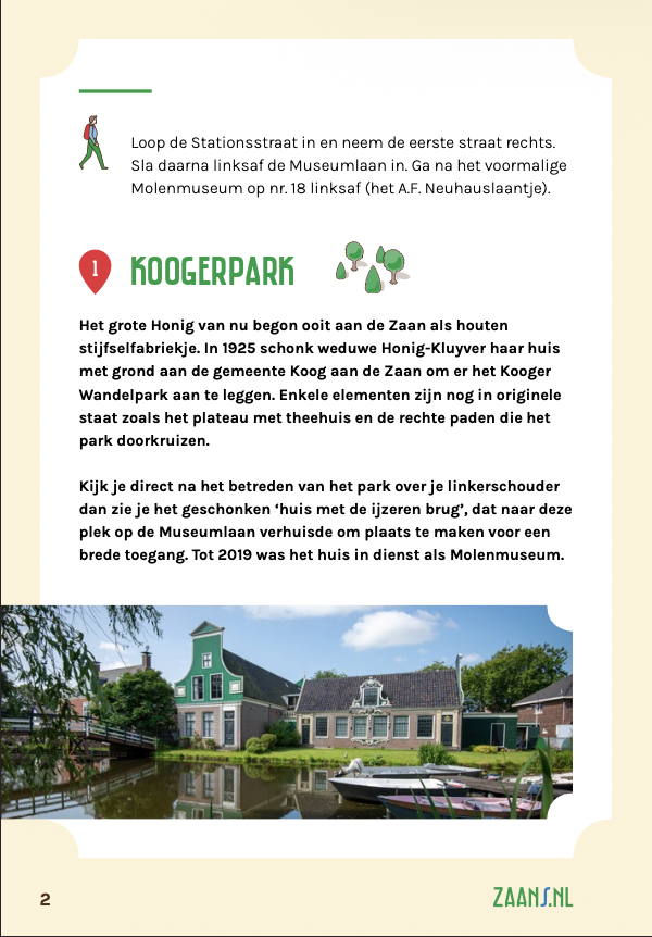
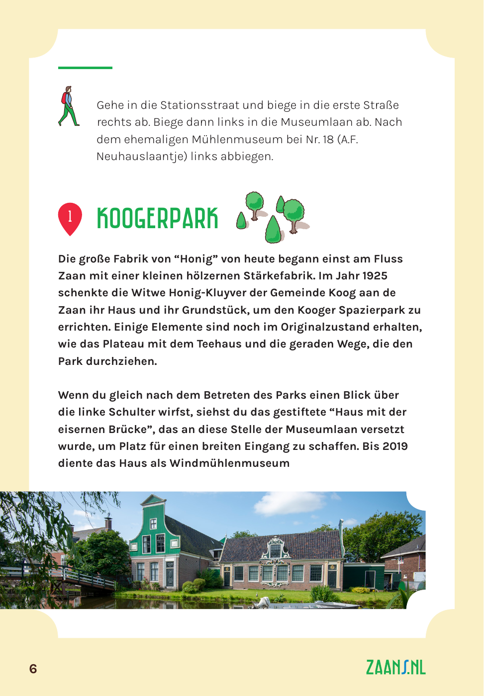
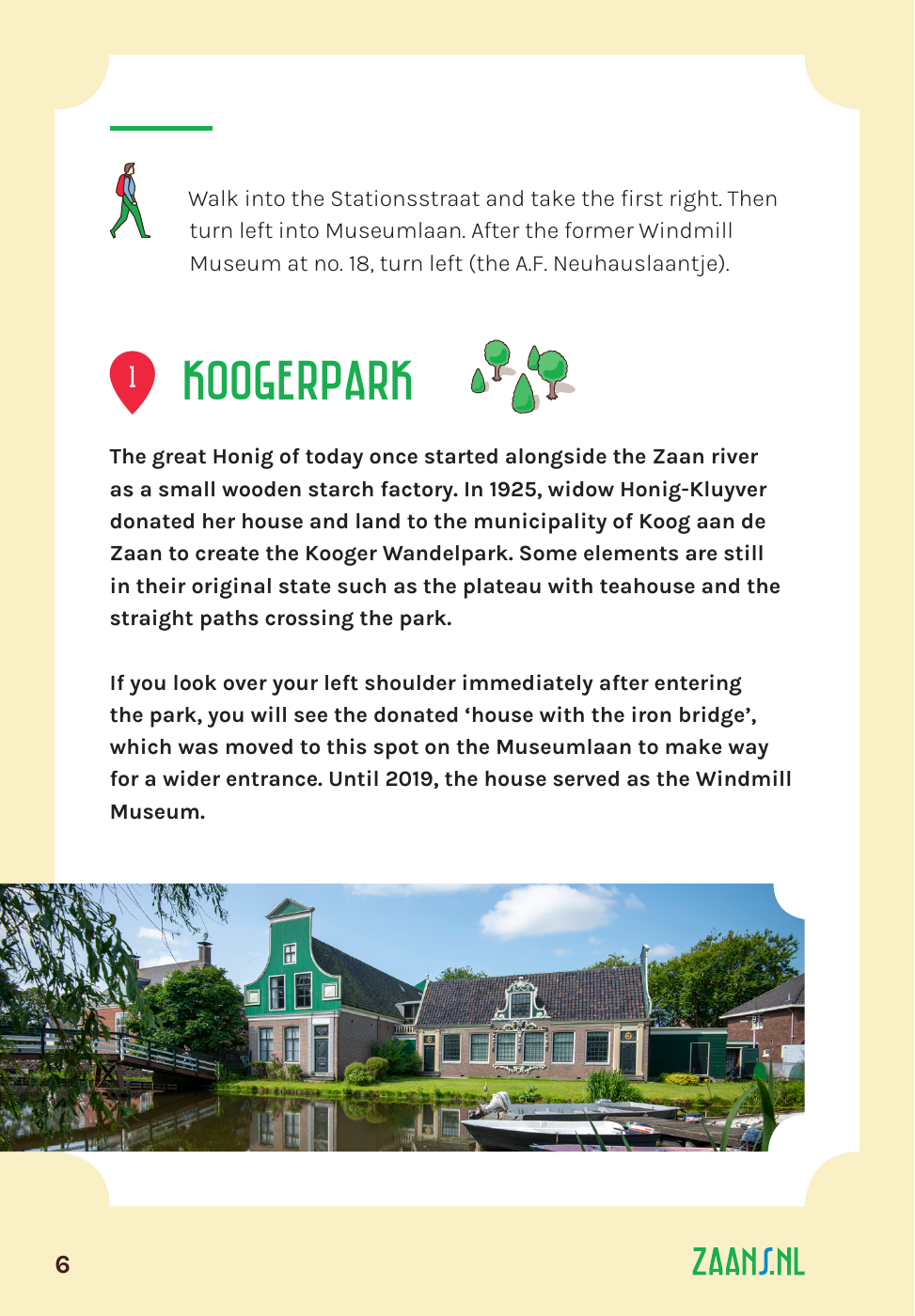
Dutch, German and English editions of one walking guide.
The agency needed English and German editions of an existing guide. I studied the ZAANS brandbook and adapted the layouts so each language felt native.
Translation was the design constraint. English contracts; German expands. Each edition had to keep the same visual rhythm without making one language feel squeezed.
Een boek moet eerst moeiteloos leesbaar zijn voordat het indruk probeert te maken. Lettertype, zetbreedte en regelafstand moeten de lezer zonder wrijving door de pagina laten bewegen.
Bewerkt naar William Morris, Het ideale boek (1893).
A book should be easy to read before it tries to impress. Type, measure, and line spacing should let the reader move through the page without effort.
Adapted from William Morris, The Ideal Book (1893).
Ein Buch sollte zunächst mühelos lesbar sein, bevor es beeindrucken will. Schrift, Satzbreite und Zeilenabstand müssen es der lesenden Person ermöglichen, sich ohne Anstrengung über die Seite zu bewegen.
Nach William Morris, Das ideale Buch (1893).
The same route introduction in each edition. The frame is fixed — structure, imagery, color, navigation — and only the text moves. It moves a lot: German runs longest, and the layout has to absorb that without being redrawn.
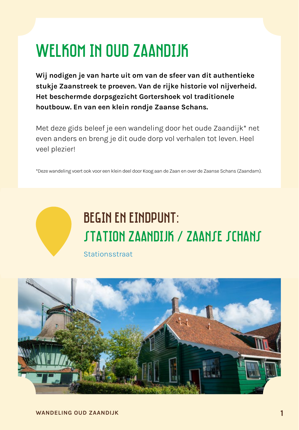
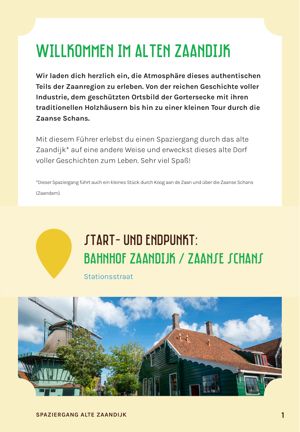
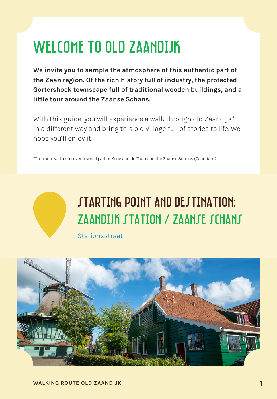
I treated it as the source of truth across logo, color, type, patterns and imagery — nothing in the new editions was invented where the brandbook already had an answer.
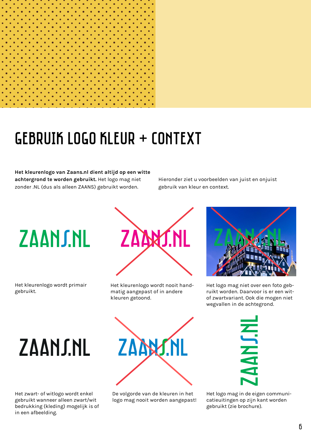
The brandbook fixes the clear space and the backgrounds the logo is allowed to sit on. Both new editions inherit them unchanged.
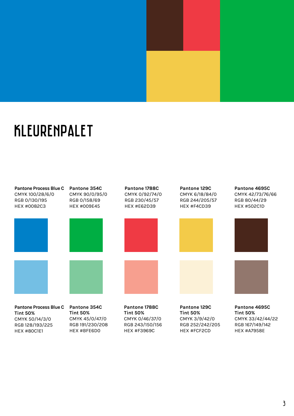
Every edition draws from the same five colors and the same 50% tints. No new color was mixed for the translations.
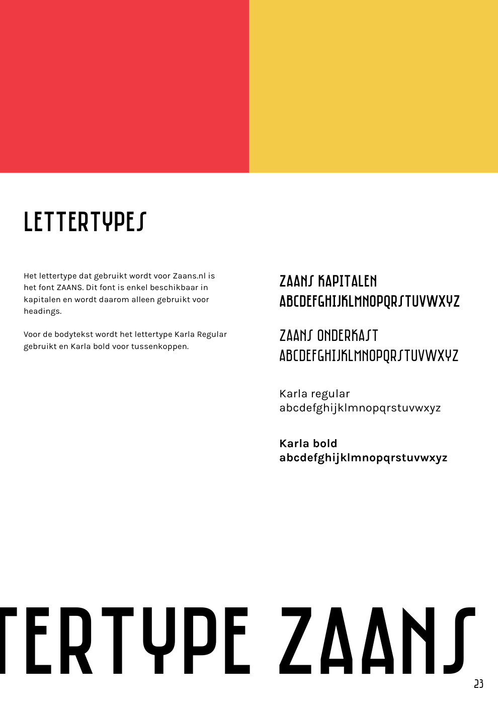
The display face stays fixed in all three editions. The translations are fitted to it, rather than the other way round.
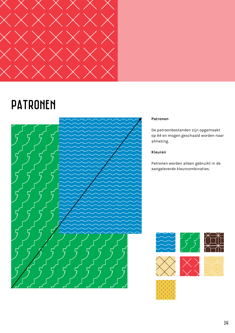
The German and English pages reuse the same pattern and shape set as the Dutch original.
Thirteen approved illustrations — mills, warehouses, boats, cheese — carrying the wayfinding that photography would have made heavy.


I kept maps, landmarks, start points, parking symbols, and place names aligned across editions. Text and images were fitted inside the existing frames.
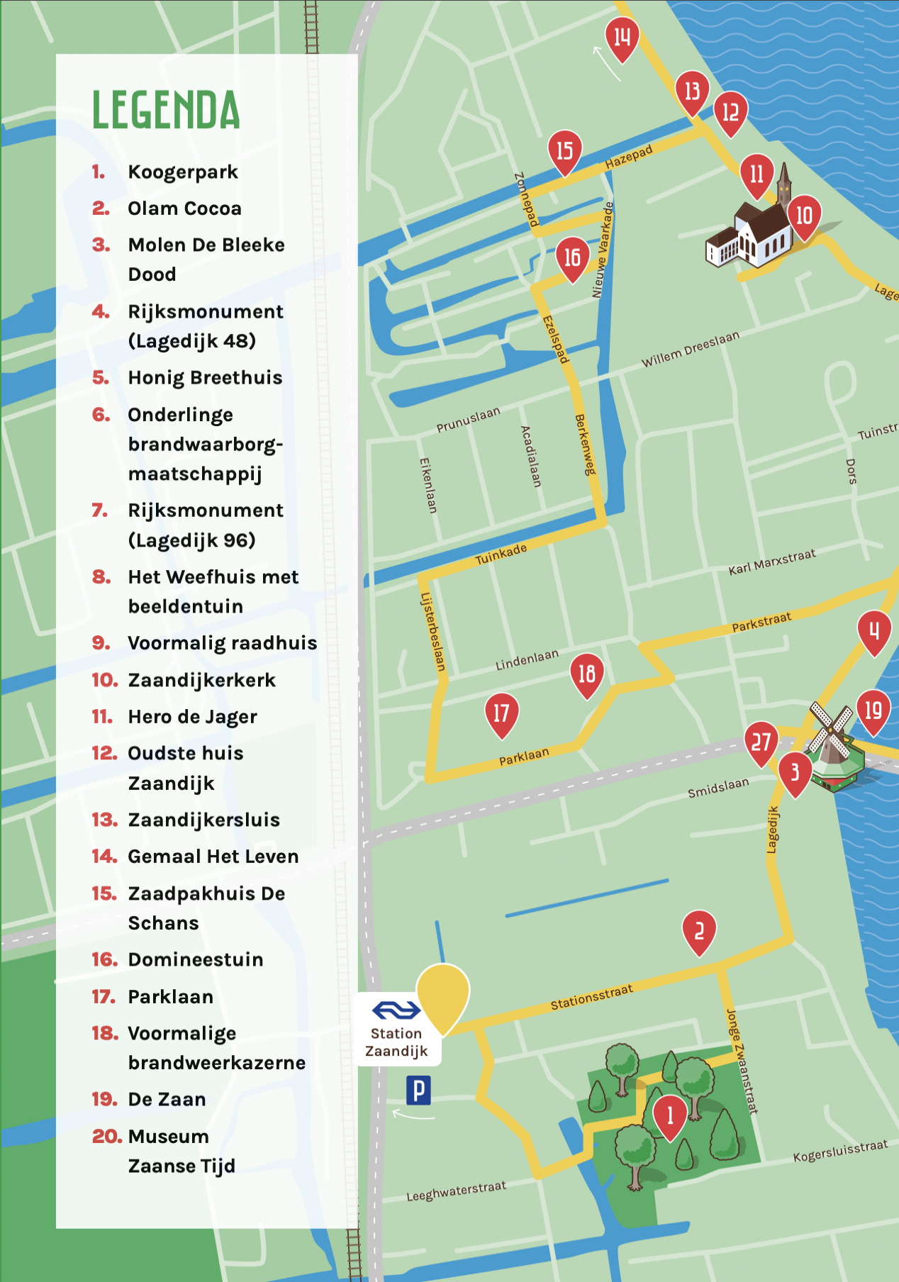
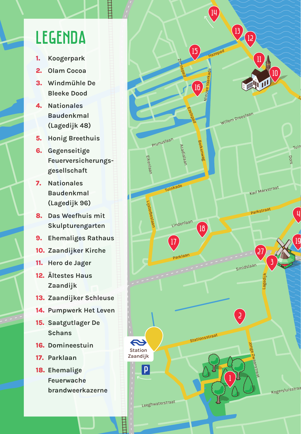
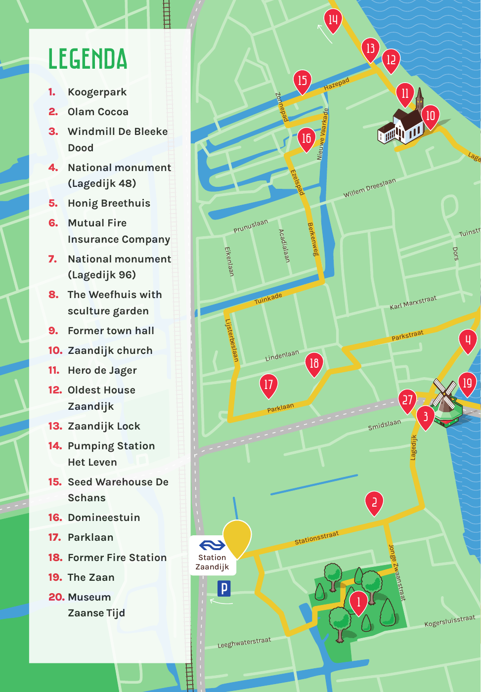
Start with the brandbook: color, type, graphics, image treatment, and approved assets.
Fit the translations and resize images without disturbing the established layouts.
Name the InDesign files and layers so the agency can open them a year later and still find the route pages.
Across Dutch, German, and English, the ZAANS brandbook remained the governing system. I resized image frames where the copy allowed it, scaled icons to preserve optical balance, and edited the translations for clarity, rhythm, and fit — fine-tuning line breaks, tracking, kerning, and hierarchy so each edition stayed legible and structurally consistent.
The visual foundation stayed intact, the translations were fitted to it rather than around it, and the agency got named, production-ready InDesign files it can reopen without me.