







Eight locked styles, top to bottom.
Chillax leads headlines, Inter carries utility text. Both stand in for the licensed faces Veeam uses; the eight locked styles are what stop anyone retyping a size by hand.
A Canva brand system for consistent marketing without starting from scratch.
Type, logos, color, voice, photography, components, graphics, icons and templates — plus the two tabs on how it was built.
Chillax leads headlines, Inter carries utility text. Both stand in for the licensed faces Veeam uses; the eight locked styles are what stop anyone retyping a size by hand.
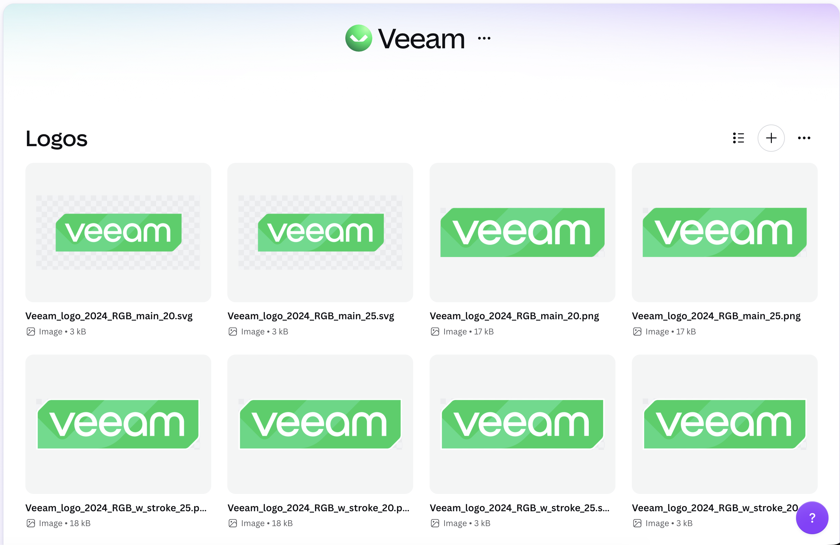
Each mark is sized and cleared for its context, so nobody rebuilds one from a screenshot of a slide.
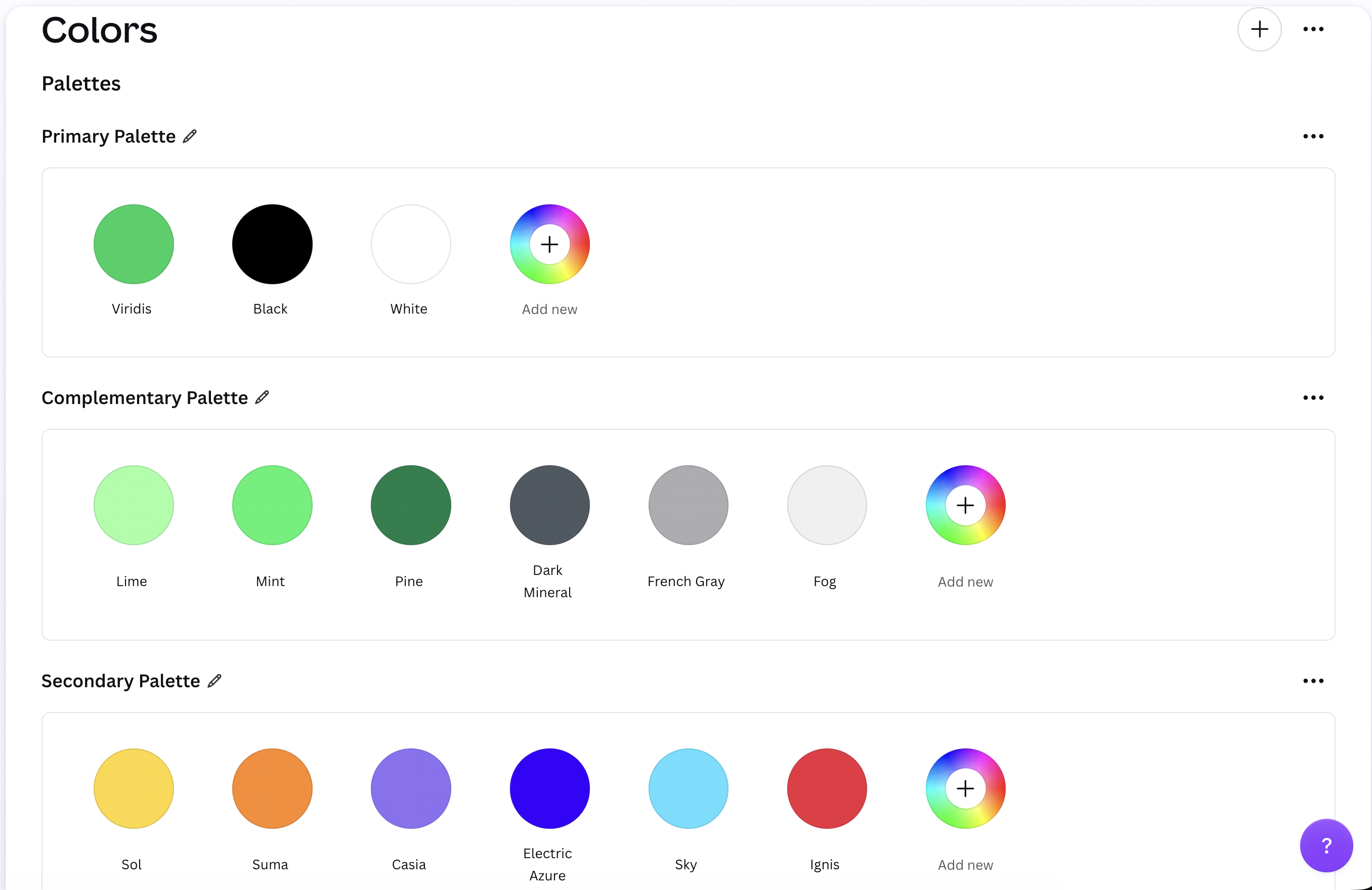
Colors are filed by what they do — surface, accent, data — so picking one is a decision about the job, not about the hue.
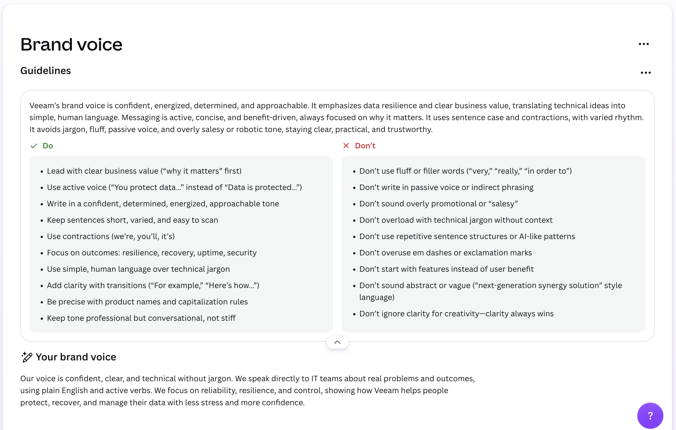
Active, clear, human — set out as pairs a marketer can check a draft against in about ten seconds.
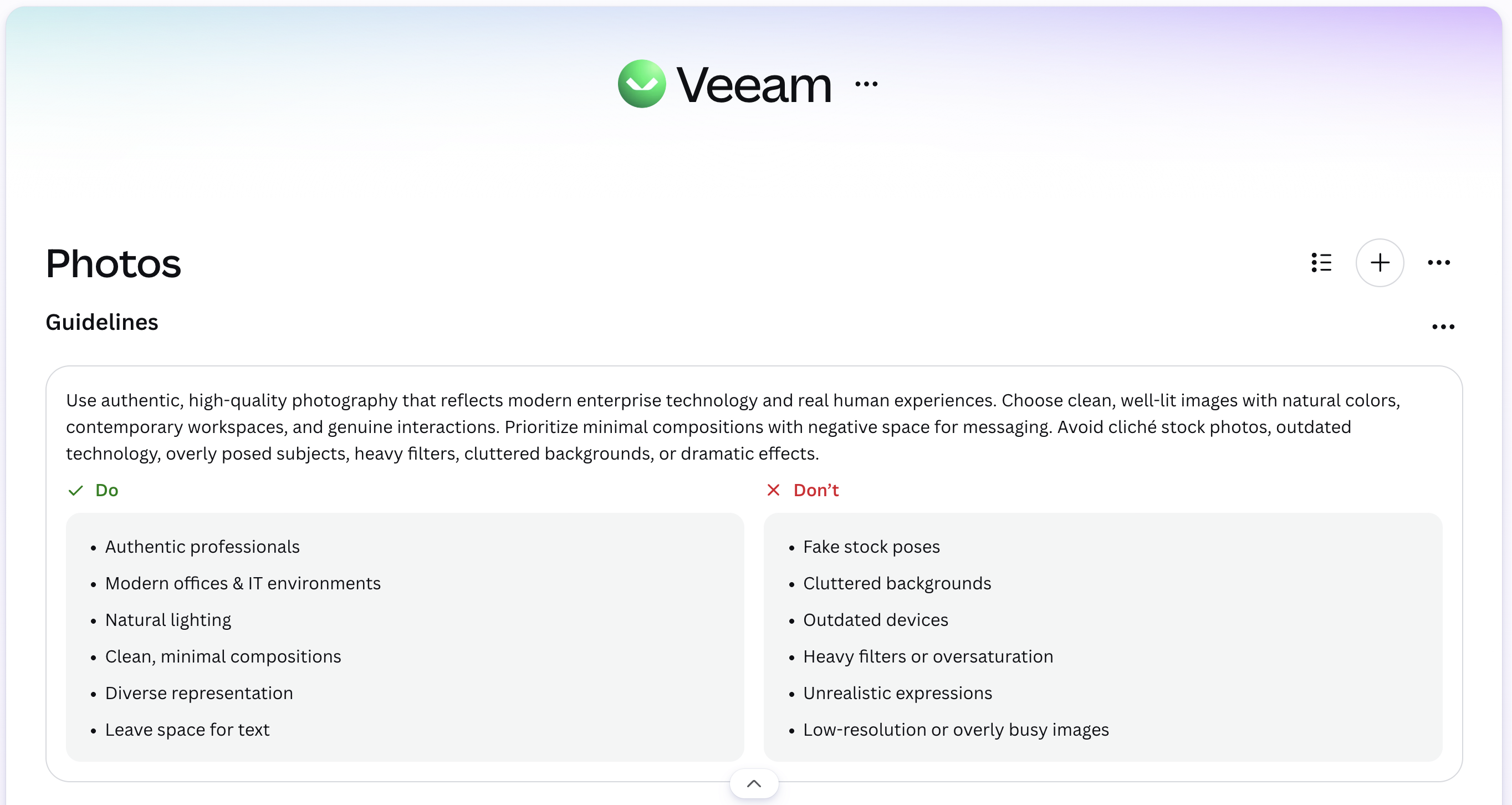
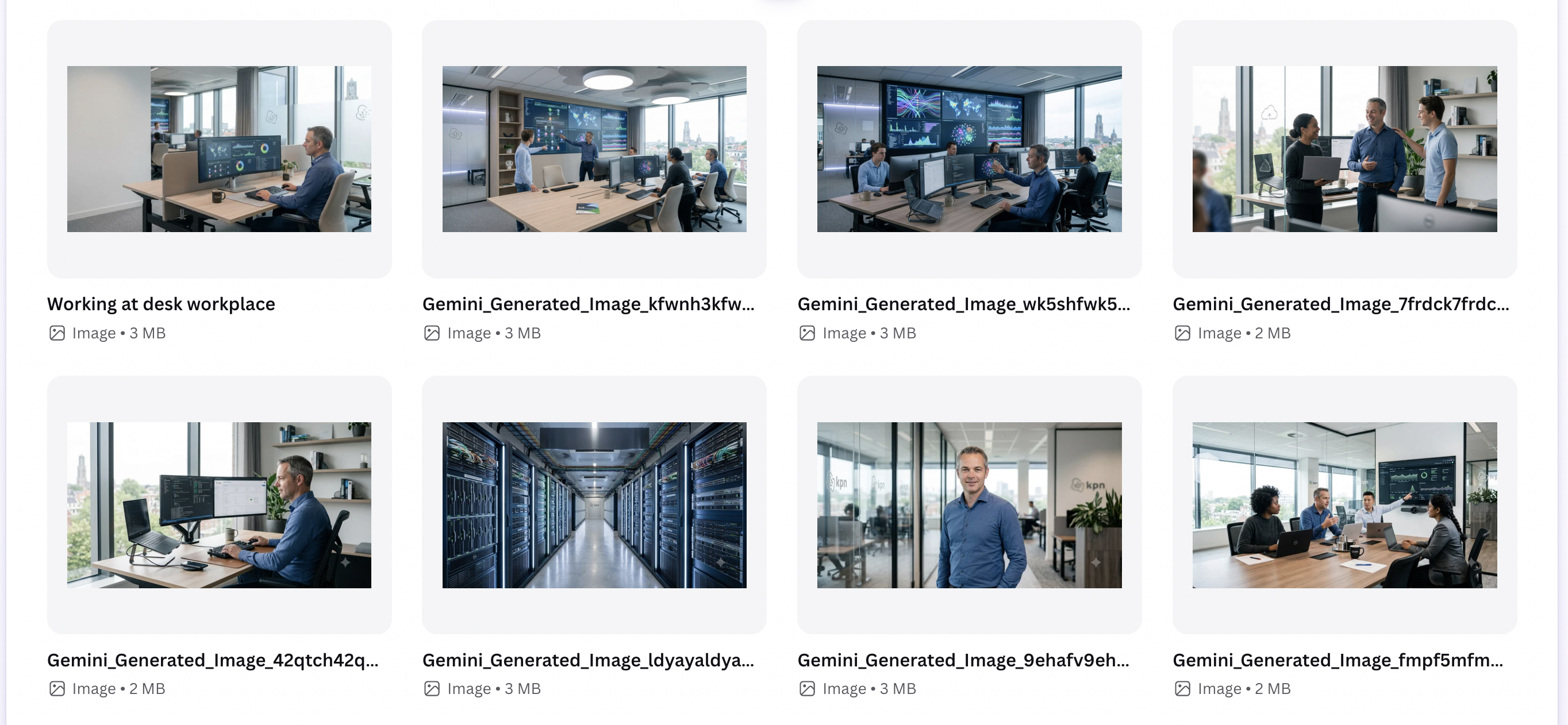
Guidelines, do/don’t pairs, and prompts that keep generated images looking like the brand rather than like stock.
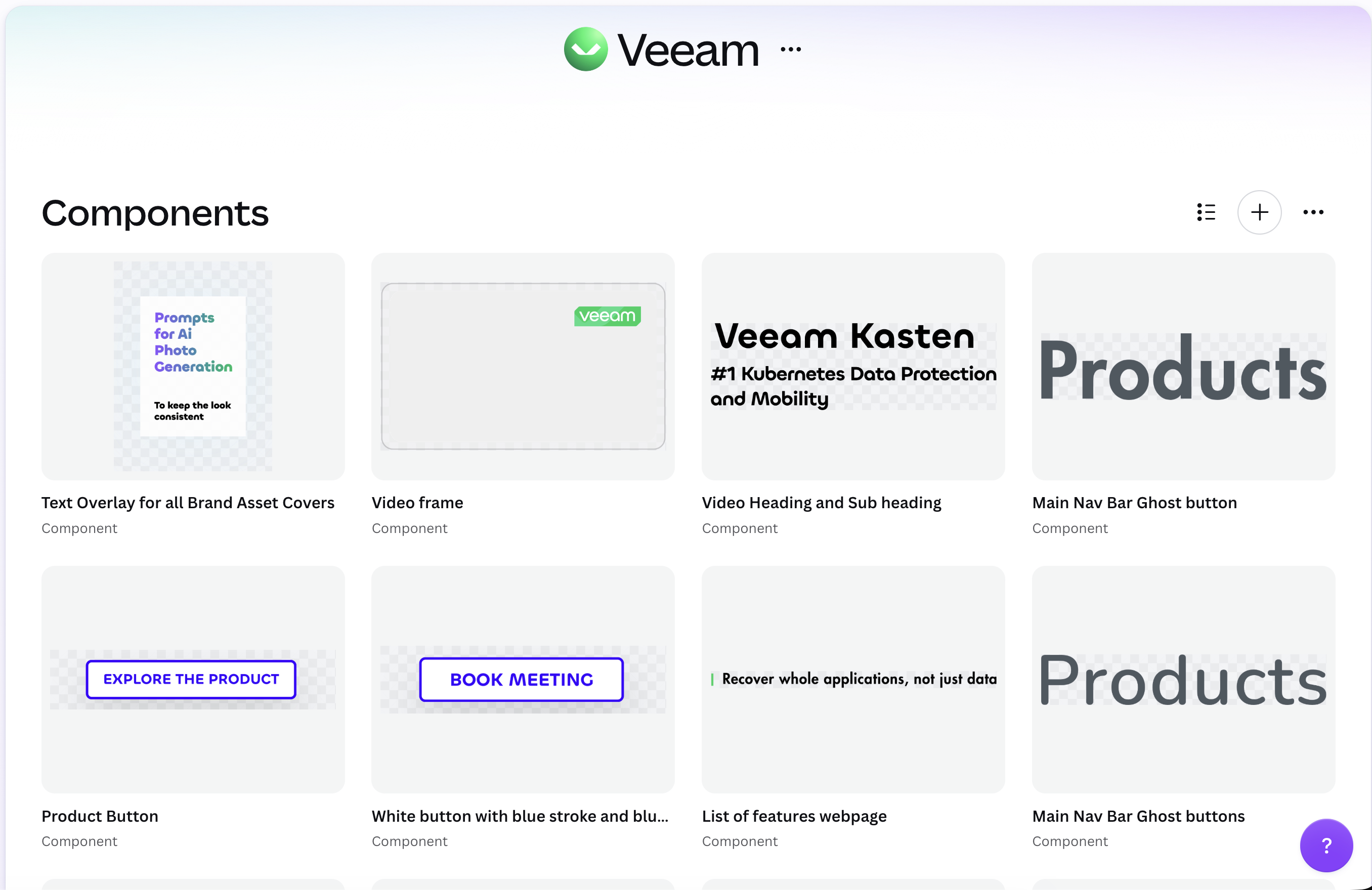
Buttons, headings, labels and overlays are saved as components, so a layout gets assembled rather than redrawn.
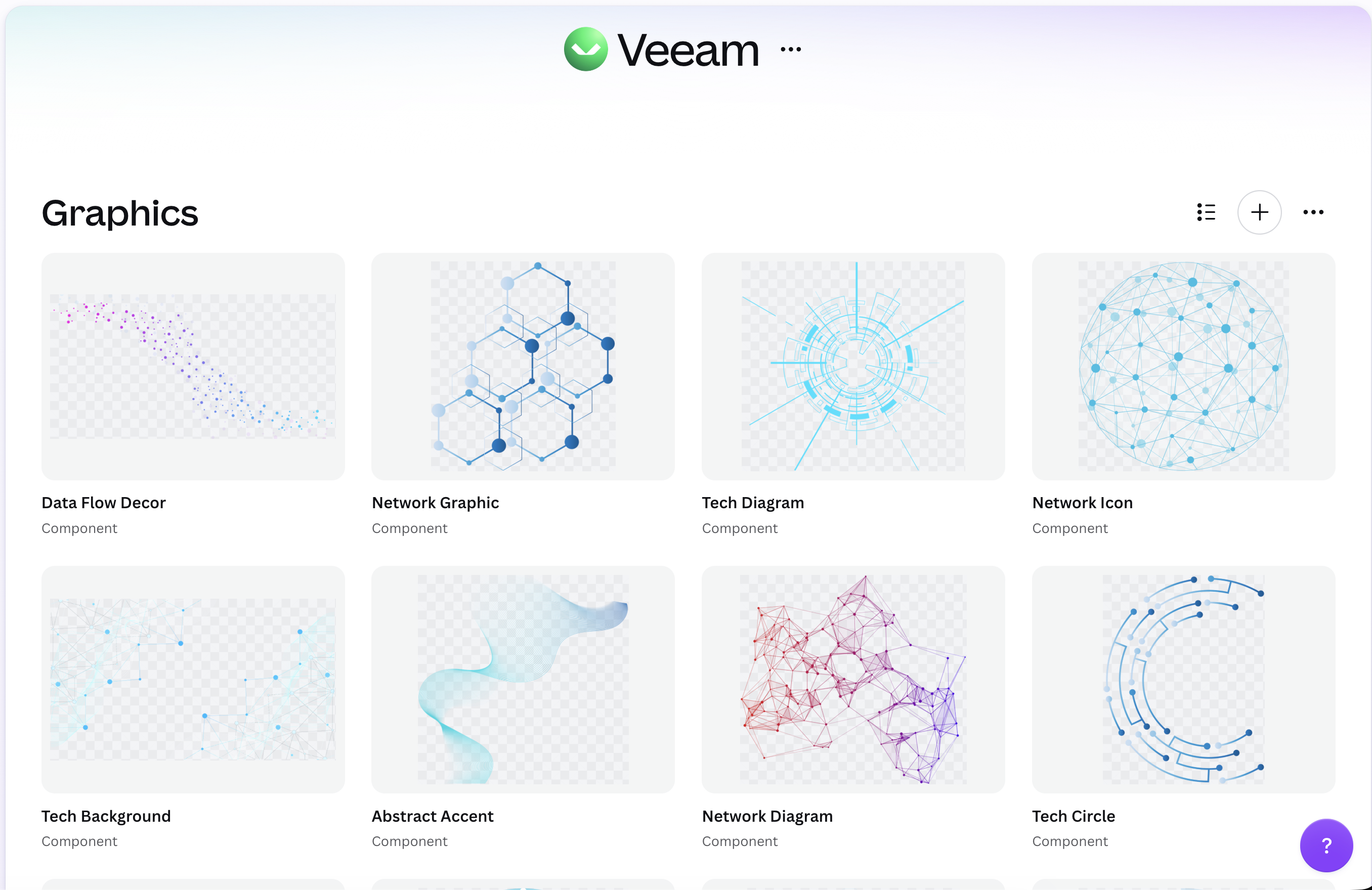
Data flows, connectors and accent shapes, so a complex idea never gets sketched from scratch inside a deck.

Each mark is pre-made in its allowed crops, colors and treatments, so nobody recolors one by hand and drifts.
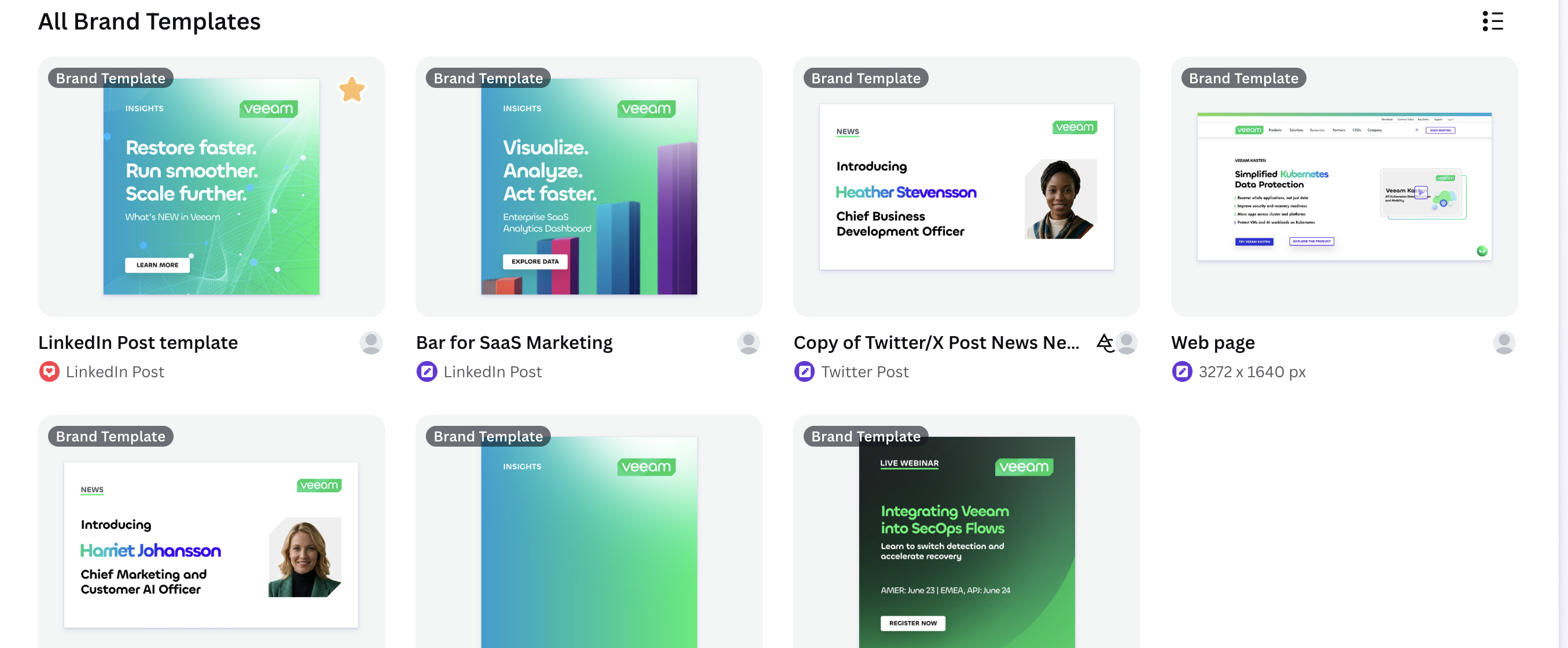
Open one, replace the words, publish. This is the only tab most people will ever need to open.
I chose Chillax and Inter as the closest available matches to the fonts Veeam uses. Everything above is set in the substitutes, not the licensed originals.

Canva MCP and Codex, working from the same guidelines. The output lands on-brand because the rules are machine-readable — not because someone remembered them.
Browse the approved templates, choose an occasion, then swap the content. I cut every step in between that used to make someone stop and ask a designer.
Browse Veeam’s Canva brand kit, choose the format that fits, and start from a template that stays on-brand by default. Each one has its own feel without sacrificing legibility, type or color.

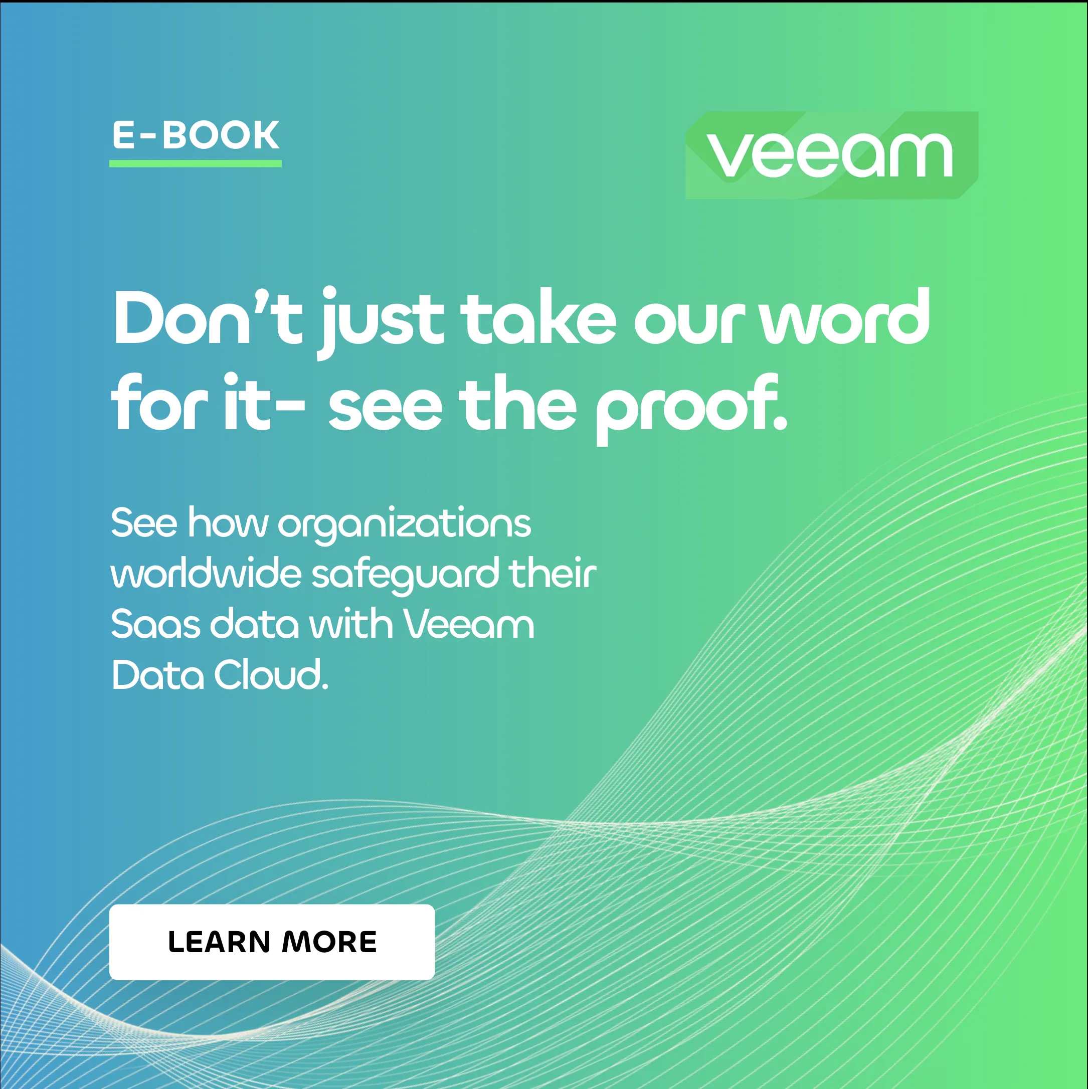
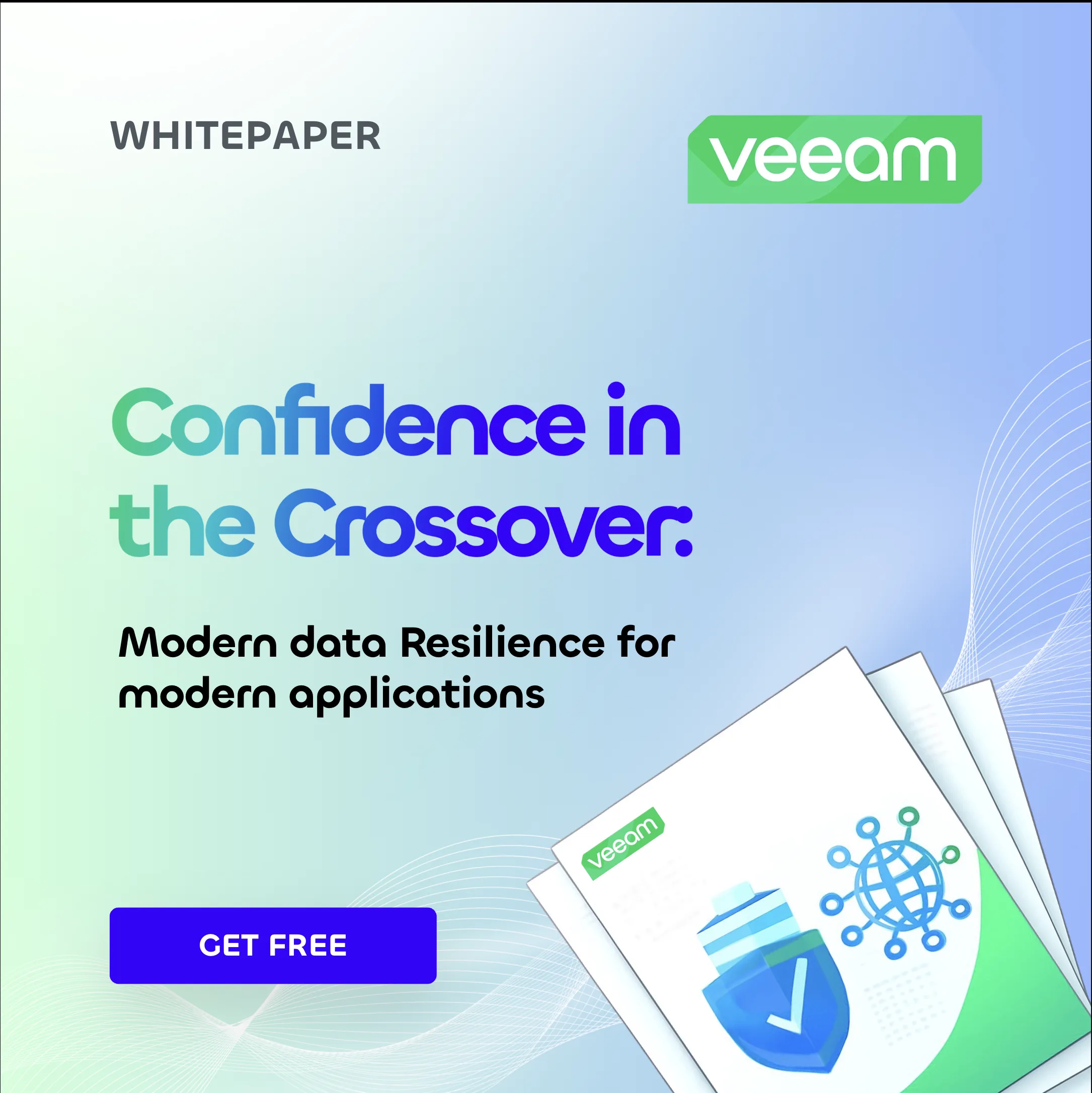


Spent too much time in the terminal and forgotten what design looks like? Need a polished live-webinar announcement without starting from scratch? Choose a template — the guardrails keep type, color and layout on-brand while you focus on the message.
A prompt system guides image generation with positive and negative criteria. AI creates options; brand rules and human review decide.









With an organized Canva Brand Kit, an animated reel is as easy as dragging a few components from the library. This is one quick example.
Connecting Canva’s Brand Kit to Codex and Remotion shows how quickly I can learn new tools, translate brand rules into motion, and make polished, on-brand content that others can reuse.